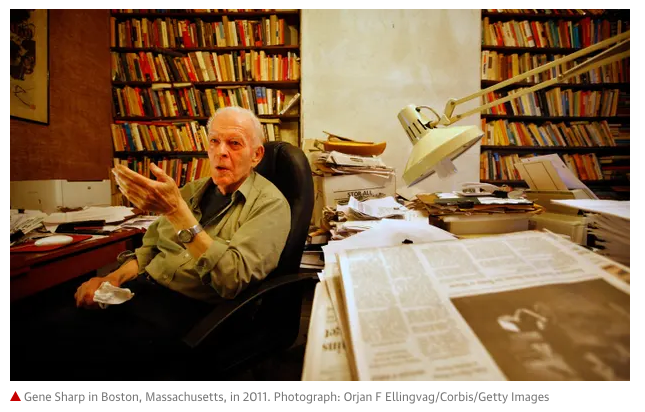
A couple of books that have influenced the way that I garden and care for my 1/3 of an acre are Doug Tallamy’s Nature’s Best Hope and The Hidden Life of Trees by the German forester Peter Wohlleben. While there have been, especially in Europe, critical reviews of Wohlleben’s use of anthropomorphic language about trees’ interaction, it’s an entertaining book. The pandemic has offered a rare treat; extra time for reading in lieu of in person interactions.
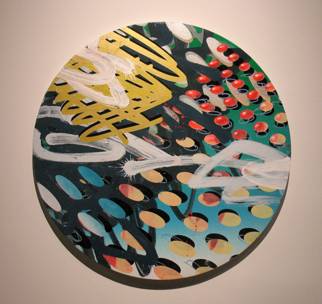
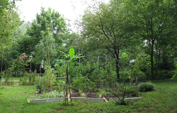
When I moved back to the Atlanta metro area in 2010, I focused on adding more plants with a variety of heights that would be interesting to paint. My studio (in a former porch now enclosed) faces the backyard with three sides of sliding casement windows that offer a 180 degree view. Some of what I’ve added to the yard since then, like Canna lilies and Musa basjoo (Japanese banana tree), have proven invasive or at the least, aggressive enough to shade out other plants. I dug up most of them this summer and gave away to neighbors.
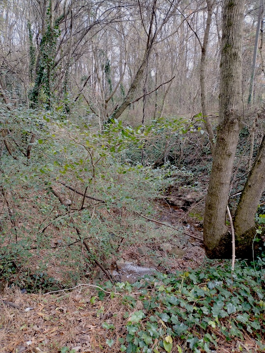
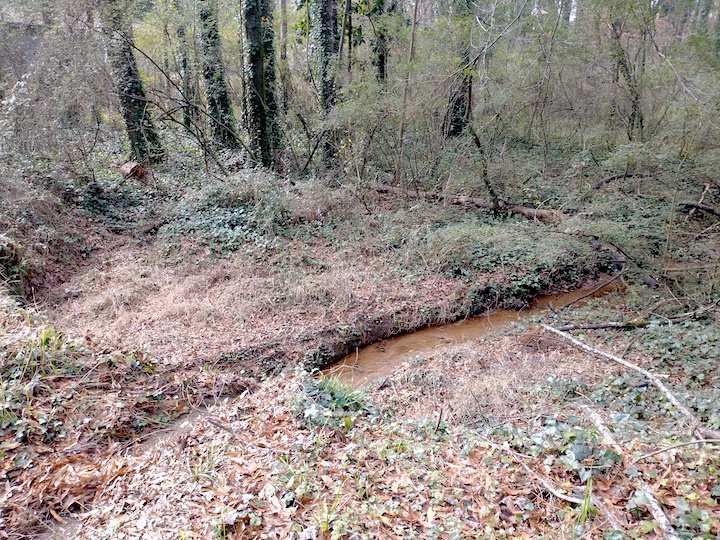
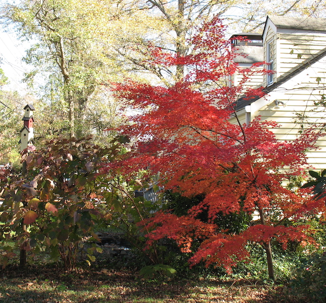
Tallamy’s book encourages removal of additional invasive plants that don’t attract many birds or pollinators, the Wohlleben book advocates appreciation for the trees in my yard, mature and recently planted. In 2015, after a subdivision replaced a completely forested acre behind me, I planted about 25 young trees – as in mere 1ft saplings – along both streets that the large corner lot borders, in the yard and to screen the back boundary. Most have grown nicely and I got lucky by choosing strong and wind resistant varieties like dogwoods, redbuds, white hawthorns, and crape myrtles. Sadly, that’s not so true for my mature pecans and large water oaks, which dropped branches all over the yard during Tropical storm Zeta this past October.
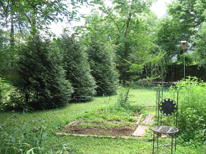
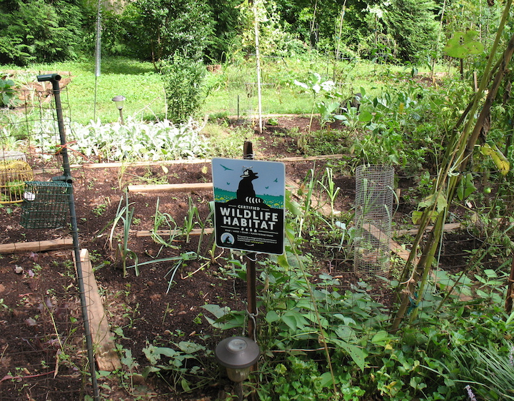
After chatting one morning with a neighbor who’s also an avid gardener, I signed up for a UGA/Dekalb County Master Gardener program that began in January before most realized the reach of the virus, continuing with virtual classes, to finalize in late April. Our last in person class was in early March. I thought Covid would interrupt my volunteer requirements, but creating a plant database for one non-profit garden center and producing a webinar for a seminar on shade gardening enabled me to log most of the mandated 50 hours. The Master Gardener program convinced me that I needed to go native to ensure that bees, insects and birds thrive in my yard and help pollinate the vegetable gardens. I even applied for certification from the National Wildlife Federation to advertise the benefits of natural landscaping to leaf-blowing, herbicide and pesticide using neighbors.
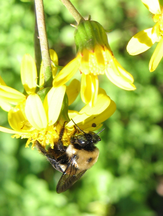
This spring and summer I yanked out all of the invasive vinca, four o’clocks (Mirabilis jalapa), creeping ivy and brambles on my 200 foot stretch of hill to plant native wildflowers attractive to birds and pollinators. Some of those include two varieties of Goldenrods, (Solidago speciosa and Solidago rigida), Joe Pye weed (Eupatorium maculatum), Swamp Milkweed (Asclepias incarnata), Cardinal flower (Lobelia cardinalis), red and purple Coneflower (Ratibida columnifera, Echinacea purpurea), New England asters (Aster novae-angliae), Wild yarrow (Achillea millefolium) and Wild Columbine. I hope they all germinate and fill up the spaces in a couple of years.
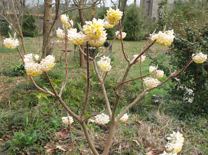
Gardeners know patience, there’s no rushing nature. Some of my plants and shrubs that have been gifted or shared are, if not native, great pollinators. Sheffield Pink Chrysanthemum, a gift from a dear gardener friend, lures all kinds of bees and propagates easily. A generous neighbor gave me a Bottlebrush Buckeye (Aesculus parviflora), a now large Viburnum buddleifolium and an exquisitely fragrant Edgeworthia chrysantha shrub, native to woodland areas in the Himalayas and China. Other shrubs and plants were purchased from local nurseries or the seasonal DeKalb County/UGA Extension plant sales.
Other books; Barry Lopez is a favorite nature writer and I’ve been enjoying his recently published Horizon for the past year, living vicariously through his incredible journeys to the far reaches of our world. I haven’t yet gotten to the Canadian Arctic, although I did live in Nova Scotia for a couple of years. And while I took a two month broadcast design gig in Moscow during 1986 in the midst of perestroika, I never ventured into the wilds of Siberia. I’m not sure where my love of cold climates originated, but living in Vermont, Maine and Canada during my twenties may have had something to do with it. As this review so aptly states, Lopez’s Horizon is an epic travelogue that meshes local lore and history with an environmentalist’s tragic take on how we’ve trampled and abused this earth. An early book of his from 1978, Of Wolves and Men, is more specific to one animal but also includes the ways in which the American Indians appropriated the wolf’s hunting methods and even used the animals for tracking their enemies.
We’re now almost at the end of this long, birdsong filled year. I’ve begun walking miles around my neighborhood and the nearest small city to make up for the loss of my usual vigorous lap swims. No other form of exercise can really match what has given so much joy since childhood. Snow is forecast tomorrow, Christmas day, for the metro Atlanta area. A dusting will encourage more drivers to run off the roads and skid over black ice. Nature remains perfect in its form and intent, despite the raging infection threatening our species. And as always, my efforts to protect a small spot in the world constantly butt up against urban development and continued “growth”.